SPEED LIMIT
(Graphic by SDR)
RAILROAD CROSSINGS
While in Mexico, I saw a few crossbucks that read "FERROCARRIL CRUCERO / CUIDADO POR EL TREN", which means the same thing. I don't think the riddle translates well, though.

GUIDE SIGN LANE ARROWS
Some new signs for our highways?
The 1970s brought the first major redesign of standard highway signs across the U.S. Previously, all regulatory signs were English messages: e,g, NO LEFT TURN; DO NOT ENTER. Around 1972, new regulatory signage based on the pictorial signage used in Europe appeared. Why symbolic rather than good old English? Well, first of all not all drivers on the road speak English as a first language. But even for us native speakers, studies have found that recognition of a well-designed symbolic message is faster than a message conveyed in words. Pictorial signs were not new in 1972, since curve warning signs and advance intersection warnings have been pictorial in the U.S. since at least the 40s.
New conventions were introduced with these new signs. The most significant of these conventions is the negatory red circle (usually with a slash): an action is pictured, and by virtue of placing a red circle or circle-slash, the message DO NOT DO THIS is instantly conveyed. It is interesting to note that, while the U.S. adopted many European pictorial sign conventions, it retained the standard shapes to which North American drivers had become accustomed. In Europe, a circular sign is regulatory, while in North America a regulatory sign is vertically rectangular or square. A warning sign in Europe is triangular (apex up), while in North America it is square on point (diamond). The new symbols for the U.S. were adapted to the familiar shapes. A couple of new standard sign shapes were introduced as well: the five-sided "schoolhouse" shape for school and school crossing signs, and the pennant for END PASSING ZONE. Europe, in turn, adopted the octagonal STOP sign (including the word "STOP" regardless of the local language).
There were a few European sign conventions that were not adopted. The following signs were not modified:
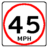
Why were these not modified? I don't know whether the Federal Highway Administration studied alternatives to these existing signs or not. I do know that in the past few years, FHwA has studied modifications to the railroad crossing advance sign and crossbuck, and has determined to leave these unchanged. As noted below, I would still revisit the issue of these signs. The speed limit signage is particularly interesting. As far as I know, the only countries that do not use the European convention of a maximum speed in a red circle are the U.S. and Canada. Mexico uses the European convention. Also not adopted was the NO PASSING symbol used in Europe and Canada, a red "prohibited" car passing a black car, displayed in a red circle.
Notice and Disclaimer:
Here Are My Suggested Modifications:
|
SPEED LIMIT |
||||
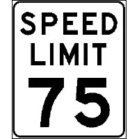
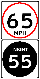
| Here is the existing speed limit sign. There are minor modifications to be found. There may be minor differences in a few states (MAXIMUM SPEED for state speed limits, etc.). Canada uses the fortuitously bilingual word MAXIMUM over the posted speed limit (the units "km/h" are not used, nor is MPH used on a standard regulatory (as opposed to advisory) speed limit sign anywhere in the U.S.). | |
The proposed modification adopts the European convention. One change that I would propose for the foreseeable future is to add the units MPH below the speed. While this could be used as a transitional feature, I would use it indefinitely because of the possibility of converting to metric units in the future. The size of the sign would be the width of the current standard speed limit sign. | |
|
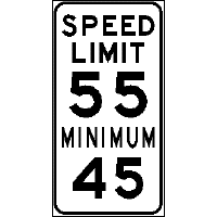
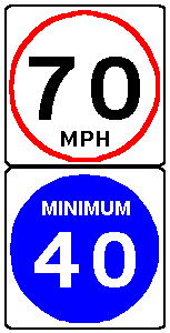
| Minimum speed limits are also marked frequently on freeways. The sign may be combined with the maximum speed limit sign or be on a separate post. | |
What convention indicates "MINIMUM" to drivers? I don't know, and so I propose using a blue background such as is standard in Germany. The legend MINIMUM would be used indefinitely, in part because the color doesn't by itself convey the message, and in part to assist color blind drivers who may not distinguish readily from other shades of color. | |
|
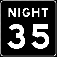
| Before establishment of the National Maximum Speed Limit in 1974, night speed limits were very common across the U.S. Now that the NMSL has been repealed, only a few states (TX, ND, MT) have restored their nighttime limits. Generally, the night speed limit signs are mounted immediately under the daytime sign, and appear as a single unit. | |
The black background should trigger memories in older driver of the significance. Still, I think the legend NIGHT should permanently be a part of the sign. | |
|
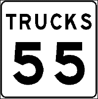
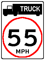
| Truck limits are used in several states, mostly on freeways and high-speed expressways. These signs are usually freestanding, though Michigan combines them with the main speed limit signs in some places. | |
The symbol of the truck should be adequate to convey the applicability of the sign. Still, I would use the legend TRUCK superimposed on the pictorial truck as at least a transition feature. Alternatively, the GVW cutoff for the speed limit (e.g., "10T") could be marked in the truck icon. Now, how to mark speed limits that apply to passenger vehicles pulling trailers?? | |
|
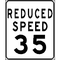
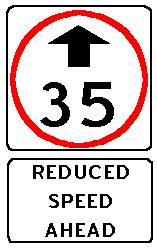
| The use of signs advising of a reduced speed limit ahead is common. The two styles generally used are either the generic REDUCED SPEED AHEAD and signs like the one at right specifying the speed. | |
This is based on Canada's design, identical to this except for the use of the red circle. (I believe Canada initiated the use of the arrow for "ahead."). The auxiliary sign pictured below would be a transition feature only. | |
|
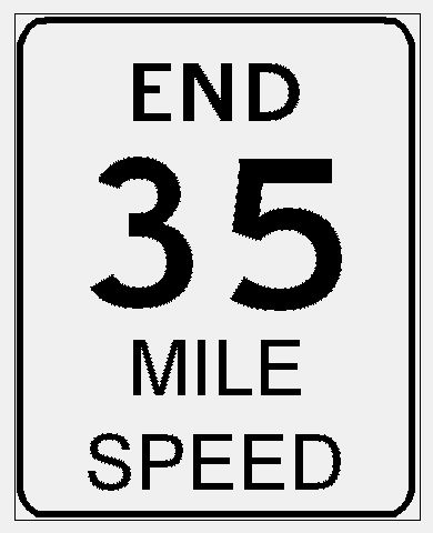
| This sign isn't used nearly as much as it used to be. (Another version seen before the 70s was "RESUME SPEED.") On major highways, the resumption of the state speed limit is generally marked with a standard speed limit sign. However, on lesser roads where the statutory limit may be inadvisable, this sign is sometimes used. (You see it commonly on county roads in Minnesota). |
(Graphic by SDR) |
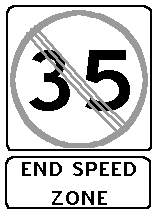
Here's another European convention: the gray circle and slashes to denote "end of regulatory zone." Although the speed indication should convey the meaning, for a transition period, I'd add the auxiliary sign shown here. | |
|
|
RAILROAD CROSSINGS |
||||
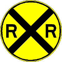
| Why is the old RXR sign still in use? It is the only circular warning sign (the only other official use for the circle is to mark emergency evacuation routes). It seems out of date, and wouldn't be immediately obvious in meaning to a non-English speaking driver. (For example, "railroad" in Spanish is "ferrocarril"). | |
Why be different for railroad hazards, as opposed to side roads, trucks entering, and other hazards meriting a warning? Because the railroad "ladder" symbol is commonly used in conjunction with the side road marker, I don't think any recognition problems would exist. | |
|
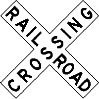
| The crossbuck is the most interesting U.S. road sign, if only because of its age. The symbol dates from before the turn of the 20th century. It is essentially unchanged, except for standardization of wording* and addition of reflectorization. The only change mandated in the last 20 years is to place a reflective vertical strip on crossbuck signposts. (The apparent outline in this illustration is not actually present on the sign.) | |
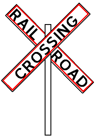
I would suggest two modifications. First, the design used in Europe and Canada has a wordless crossbuck with red outline. I would keep the words, at least as a transitional feature, but use the red outline for emphasis. | |
|
|
* Some very old crossbuck signs read "RAILROAD CROSSING/ LOOK OUT FOR THE CARS" (the latter phrase on the top arm of the crossbuck). Now you know where the first line of the children's riddle that ends, "Can you spell that without any 'R's?" comes from). The answer to this riddle, of course, is T-H-A-T.
While in Mexico, I saw a few crossbucks that read "FERROCARRIL CRUCERO / CUIDADO POR EL TREN", which means the same thing. I don't think the riddle translates well, though. |
The second proposed design is all-red background. If a highly reflective red is used, I think both of these designs would be much more visible than the existing white crossbuck that doesn't even have a marked outline. What I don't know is the impact of either of these designs on the color blind. Also, the red may not reflect adequately at night, and this sign may therefore work better during the day. (Add wide, reflective white borders??) | |
||
|
GUIDE SIGN LANE ARROWS |
||||
| Currently, downward-pointing arrows on freeway guide sign are used to tie a lane to a destination. However, in practice a lane may still split, and only the use of demarcation lines between desginations above the arrows can delineate multiple destinations for a lane. Other alternatives are the use of EXIT ONLY (generally in yellow) to indicate a lane that exits, or directional signs that use vertical arrows with lane markings. | (Graphics Coming Soon) | I propose a new guide sign lane arrow convention: a solid arrow means that the lane goes to the destination above it only. This introduces a new open, or outlined arrow to indicate that while the lane goes to the destination indicated above, it splits at the junction. | (Graphics Coming Soon) | |
Return to Minnesota Highways Home Page
Created April 7, 2000
Updated January 12, 2003